Transforming a Wallet into a Business Platform
A complete redesign of the UP Sí Vale app — from a basic balance-check tool to an active marketplace — and the organizational transformation that made it sustainable.

The paradox
Over a million users had money loaded onto their UP Sí Vale corporate benefit cards every month — ready to spend. And yet, almost nobody was spending it.
Not because they didn't want to. The app gave them no reason, no direction, and no moment to act. Users opened it, checked their balance, and left. A million potential active customers, sitting idle, and real revenue left on the table.
Understanding the user
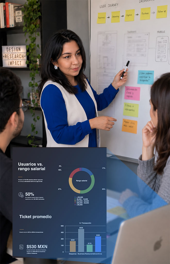
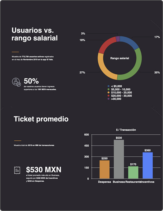
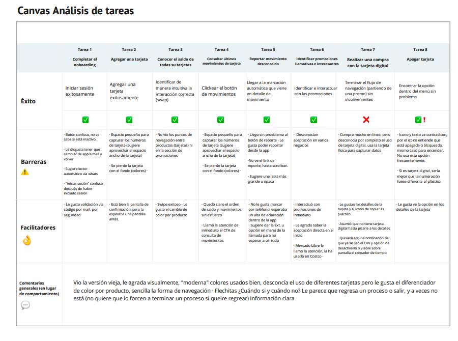
Before touching a single screen, we went to the source. Qualitative and quantitative research with real users confirmed what we suspected — and gave us the language to bring stakeholders along.
Two core user profiles emerged, grounding every design decision in real behavior and real frustration — not assumption.
Three patterns, one root cause
Every research finding pointed to the same problem: users had value available, but the product wasn't surfacing it.
Inactive users
Users opened the app once a month to check their balance — nothing encouraged a second action.
Digital value, no discovery
Users didn't know where to spend their balance. There was no way to discover brands, promotions, or nearby locations.
Accessibility issues
The existing design didn't follow accessibility best practices, excluding part of the user base entirely.
Wireframes into prototypes
Low-fidelity wireframes rethought the app's information architecture first. Every layout decision was tested and discussed before moving to high fidelity, keeping stakeholder feedback loops short and meaningful.
Low-fidelity wireframes defined the new IA · High-fidelity prototype used for usability testing
The new design
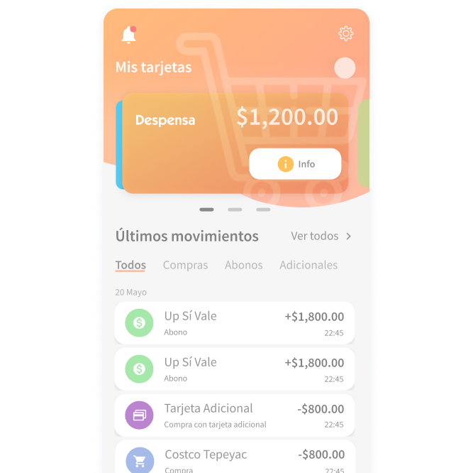
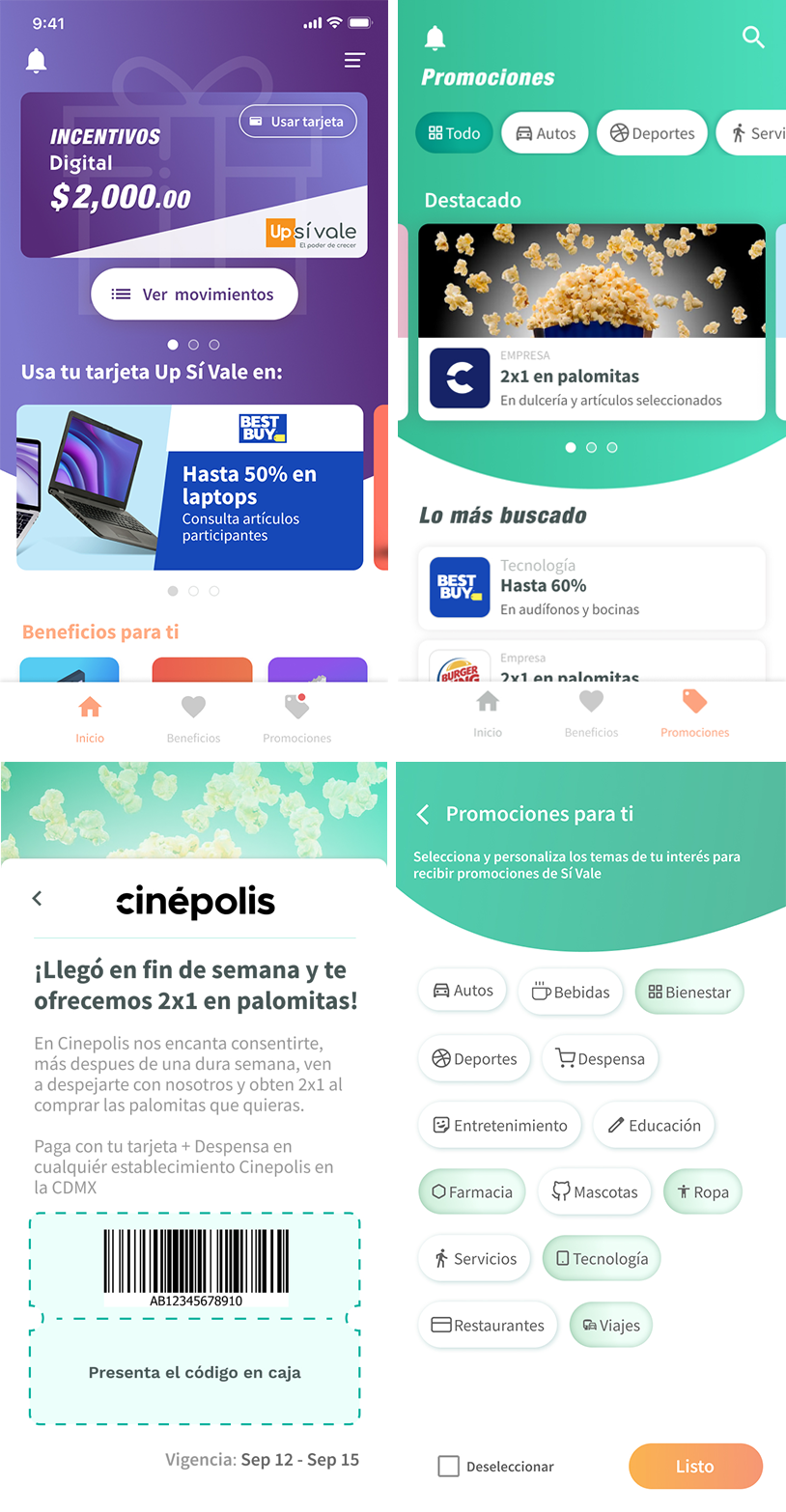
Every decision had a user reason behind it. The card now looked like a physical one — a familiar metaphor that made the digital feel tangible. Promotions, categories, filters, nearby locations, and search gave users a reason to come back.
"Rather than absorbing the friction indefinitely, we addressed the root cause — and turned a launch crisis into a governance model that made the whole operation work."
When success created chaos
Phase 1 launched with the redesigned home and five promotional slots. The response was overwhelming — partner companies flooded in, and the Alliances team began committing to launch dates with no visibility into the parallel design and development process already running at capacity.
Rather than absorb the friction, my Innovation lead and I ran an internal workshop walking every commitment-making team through how the design system worked, what Scrum looked like in practice, and what was already in motion — so promises made were promises that could be kept.
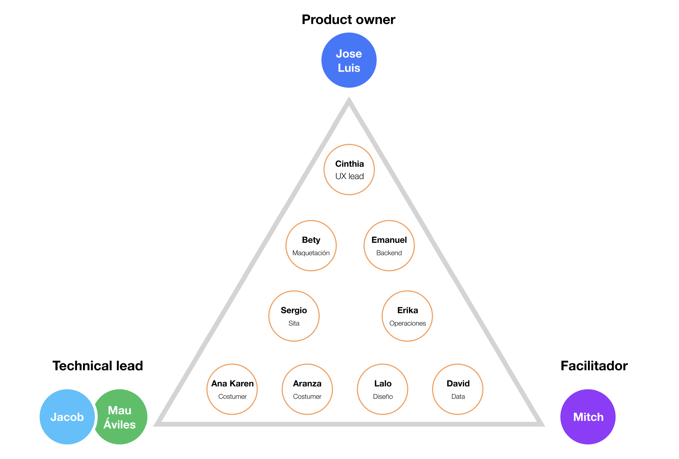
To make that transparency permanent, we built a cross-functional governance committee — Sales, Alliances, UX/UI, Development, Marketing, and Support — meeting biweekly with a shared agenda and written minutes. Full visibility, no assumptions, no surprises.
The impact
Numbers from the first two months after launch — before Phase 2 was even complete.
Beyond the screen
Driving UX maturity — Design Thinking workshops and Agile collaboration practices increased stakeholder buy-in, resulting in stronger cross-functional alignment and more user-centered decisions across every team.
Cross-functional governance — The committee connected Product, Technology, and business stakeholders long-term, standardizing design tokens and improving visibility into design initiatives across teams and projects going forward.