← Back to case studies
ResearchInformation ArchitectureBanking

Simplifying Banking at Scale

One bank, four disconnected digital platforms, and users who felt the inconsistency every time they switched between them. Research and information architecture gave every team a shared foundation.

ClientCitibanamex
My roleUX/UI Lead · Website
MethodAtomic Design
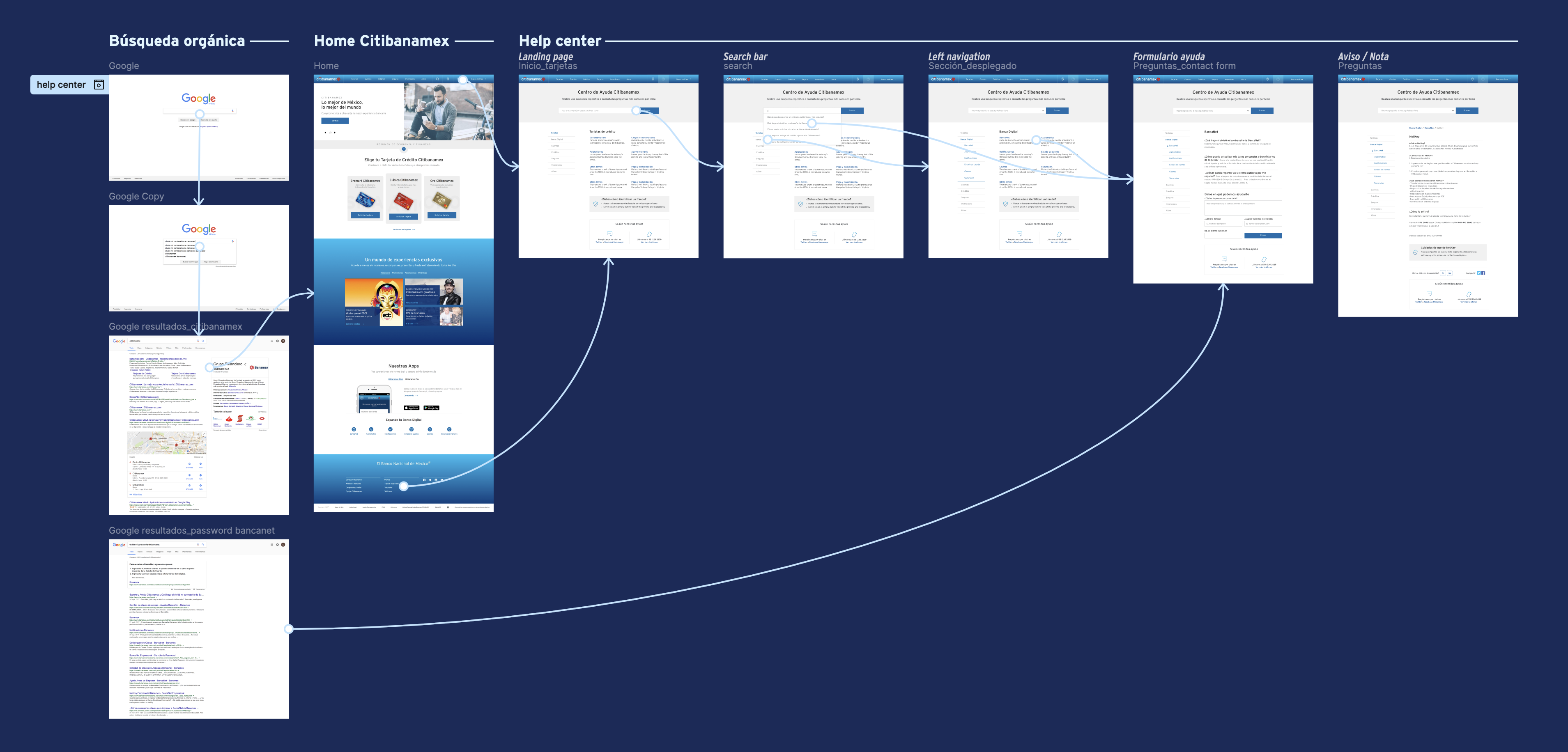
Citibanamex platform overview

The problem

Citibanamex was a single institution delivering a fragmented experience. A customer could receive a promotional email, click through to the website, and then visit an ATM — and each touchpoint felt like a different company entirely.

Different colors, different type treatments, different interaction patterns, no shared language between teams. The brand trust a bank depends on was eroding with every inconsistent pixel — and every team was solving information architecture problems on their own.

Research first, across every platform

Before defining a single component or flow, we ran research across all four platforms — mapping the existing visual and structural landscape, understanding user needs at each touchpoint, and benchmarking against IA patterns in banking and financial services.

The goal wasn't to pick a winner among the existing platforms. It was to build something better than any of them, grounded in what users actually needed to accomplish and how they expected information to be organized.

A cross-platform committee

Every platform had its own team, its own constraints, and its own decisions already baked in. For research and IA to hold across all of them, everyone needed a seat at the table from the start.

Account Opening

The first digital touchpoint for new customers, where first impressions of the brand were formed.

Business Banking

Corporate-facing platform with its own component and content needs, distinct from consumer flows.

Website (Cinthia)

The main consumer portal — responsible for the research synthesis and IA foundations for the core library.

Mobile App

The most active daily touchpoint, with strict mobile constraints and interaction expectations.

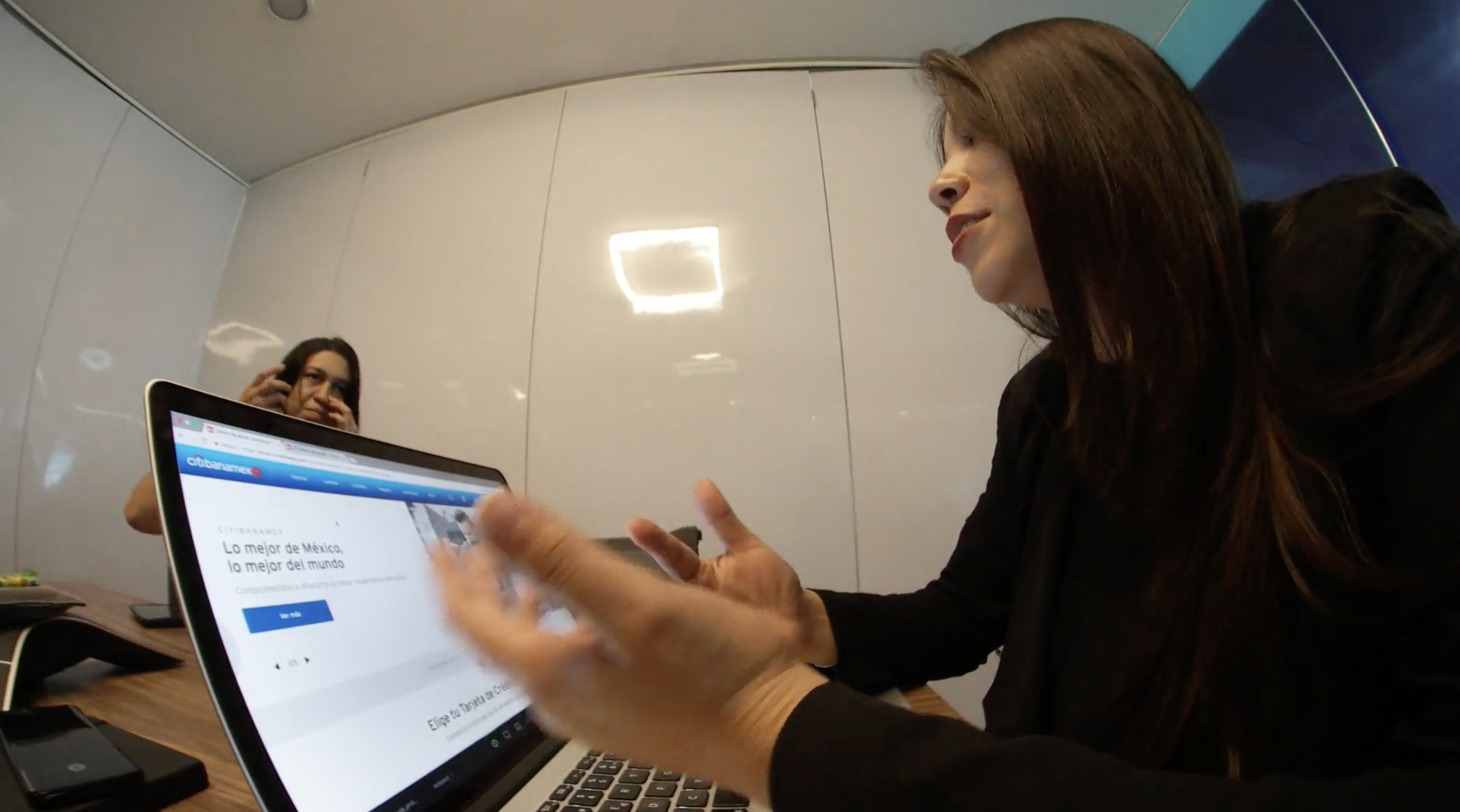
Sessions ranged from 5 to 15 people depending on the agenda — decisions made together, not handed down.

Mapping the information architecture

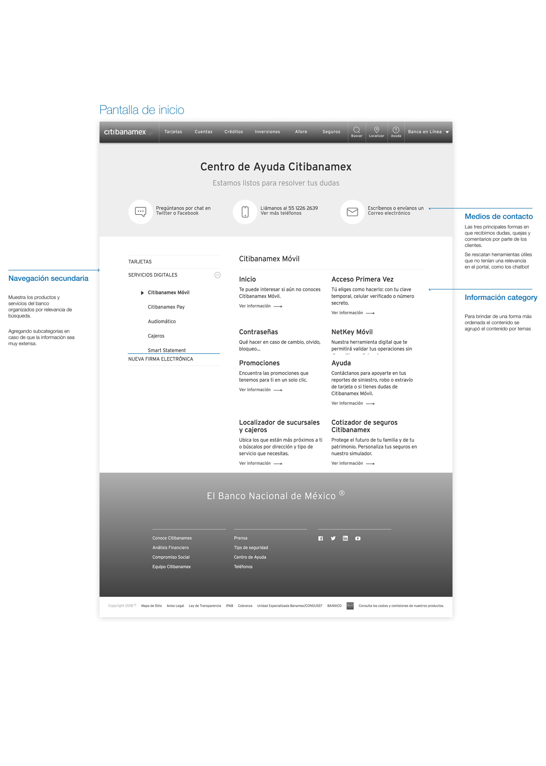
We ran card-sorting sessions with the full UX team to define shared categories and navigation logic, then built a flexible grid and layout system that gave every team a consistent spatial language across desktop and mobile — without flattening what made each platform's context distinct.

Grid system Iconography built on card-sort research

Shared grid system · Iconography defined through card-sorting research

From findings to a living system

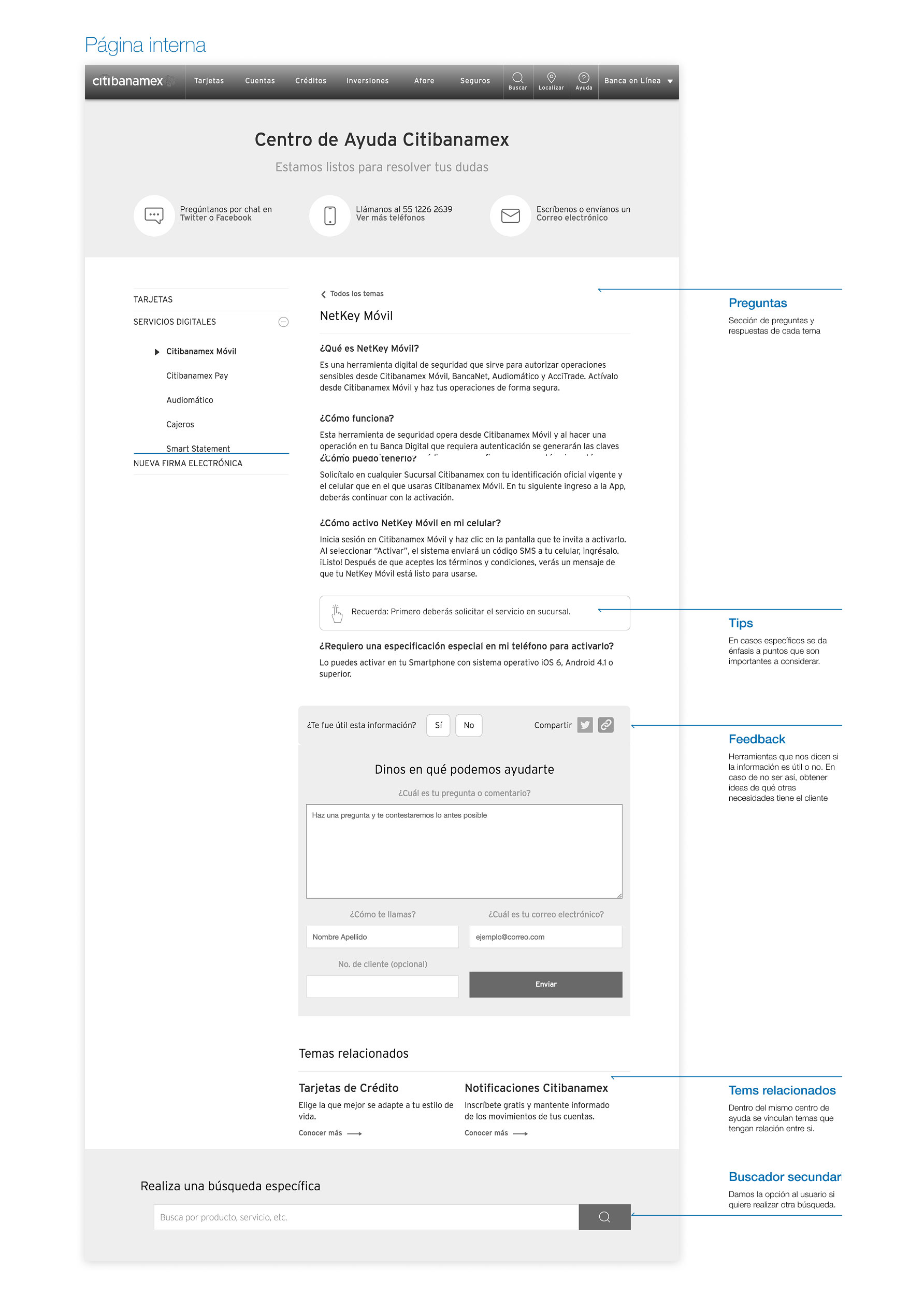
Research and IA decisions became a real, usable artifact: a documented component library — built on Atomic Design, starting from the smallest indivisible units and composing upward into full page templates — so every platform built with the same raw materials, assembled for its own context.

Atomic design methodology, atoms to molecules
"The goal wasn't to enforce rules — it was to make the system, and the research behind it, feel like something people wanted to use."

The impact

4Digital platforms unified under one design language
↓ 50%Reduction in design production time — one week to three days
1Source of truth for the entire design team